I began studying the graphic arts at Mohawk College in 1987. The programs taught conventional paste-up which was then the industry standard. A pretty big part of this training was drawing type in ink and gouache. I enjoyed this aspect of design the most and this is when I fell in love with creating letter forms. It was here I began considering font design for the first time. My instructor Wayne Burris had always said: “If you want to give back to the design community, design a font”. That really resonated with me.
Although I think this education has ultimately served me very well in my career, I graduated at the time the industry was transitioning to a digital platform. I had a portfolio full of hand-rendered type samples and I was obsolete right out of the gate.
I was still committed to enter a creative field so I enrolled at Sheridan College determined to salvage my design diploma and enhance my skill set with illustration. I devoted most of my time there to begin learning the softwares and digital techniques required by today’s industry. Though studying illustration, I never lost my passion for design and it’s here I conceived my earliest font ideas. Having an idea and actually applying them are two different things. At this point font making was still very much like alchemy for me, I had no idea how to go about it.
After almost a decade of school, I was fortunate to find my first job at a small upstart agency called Dove Marketing in Hamilton, and finally began working as a designer. Then in February of 1997, I purchased a copy of MacAddict which featured an article called “Just Your Type”, which explained how to make your own font. This proved to be the Rosetta Stone I needed. I followed the instructions and for the first time I actually created a rudimentary, functioning font. I started researching online and discovered a whole new world of independent font makers, many of whom offered advice on the process of font making. I applied this information and started making more faces. This was the very humble beginning of GautFonts.
Originally I considered this merely a hobby and I only created partial character sets. After several years of fast and furious font creation, pushing the envelope of what would be considered traditional or tasteful type design, I thought it had run its course and I ultimately lost interest.
In 2001, I joined the marketing team at Timber Specialties, where I continue to work to this day serving an array of Canadian and international clients in the pressure treated wood industry.
Then one day I was surfing the web and discovered that an individual (who shall remain nameless) had taken one of my fonts, replaced my logo and credentials with his own, and had posted his regenerated font online as his own work. I had no other recourse so my reaction was to create an extended character set which would make my font the definitive version. This was the first time I created an entire Mac OS Roman character set. It reignited and rejuvenated my love of font making.
GautFonts were first introduced on the web via TypOasis, which has been a home for many wayward font makers for many years. From there they’ve spread all over the web by means of the many font archives that have sprung up. My last GautFont posted at TypOasis was in December of 2005.
Then I seemingly dropped off the edge of the world.
From then till now, I’ve been developing new fonts the entire time, though up until the launch of this site I’ve not released any of them. I decided to slow my roll a little. The fonts were being released way too quickly before and I felt the quality of the designs were beginning to deteriorate. The glyphs are more carefully crafted and my understanding of spacing is much improved. I’ve also been a working designer for over 20 years and my experience and sense of design has evolved which has also improved my type design.
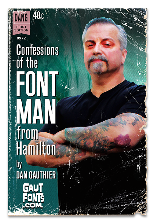
Which brings us to now. The scope of this site has evolved quite a lot in a very short time. My original intention was to retire GautFonts and introduce my new body of work which I called DangFonts. The name change represented what I viewed at the time as a departure point in my font making. However the creative minds at FPM3, who’ve worked with me to develop this site, urged me to keep GautFonts alive to capitalize on the equity of that brand. So initially this site offered both brands but ultimately I thought this too confusing. So now it’s gone full circle and is back simply to GautFonts, just like it all started.
I would also like to recognize the fact that this site probably would not have happened without my wife Kathleen’s encouragement and belief in me. Bunny, I love you more than words can express. Thank you.
This collection of fonts is inspired by the ephemera from many eras: detective, science fiction, horror and girly pulp magazines and novels, magic and novelties, film, music, comics, packaging, signage, exploitation and propaganda, and whatever else catches my fancy. The fonts I love to create hearken back to a time when hand-rendered type ruled the presses. The aesthetic is modern and retro at the same time with a little “wonk” added that shows a human presence. They are perfectly imperfect, which I think makes them less sterile. I try to make fonts that pay homage to the multitudes of wonderful designers and letterers who toiled away in anonymity. It’s challenging to create entire character sets based only on a few words or letters. It re-purposes the past and meaningfully puts it back to work for today’s designers.
I believe that after over 20 years of font making, I’ve evolved a style and a voice of my own. These works collectively form a vivid artistic statement that are a window into my mind and soul, where nostalgia, fascination, humour and fondness reside. I hope my fonts serve you well and that you love using them as much as I love making them.
April 16, 2019